







drops
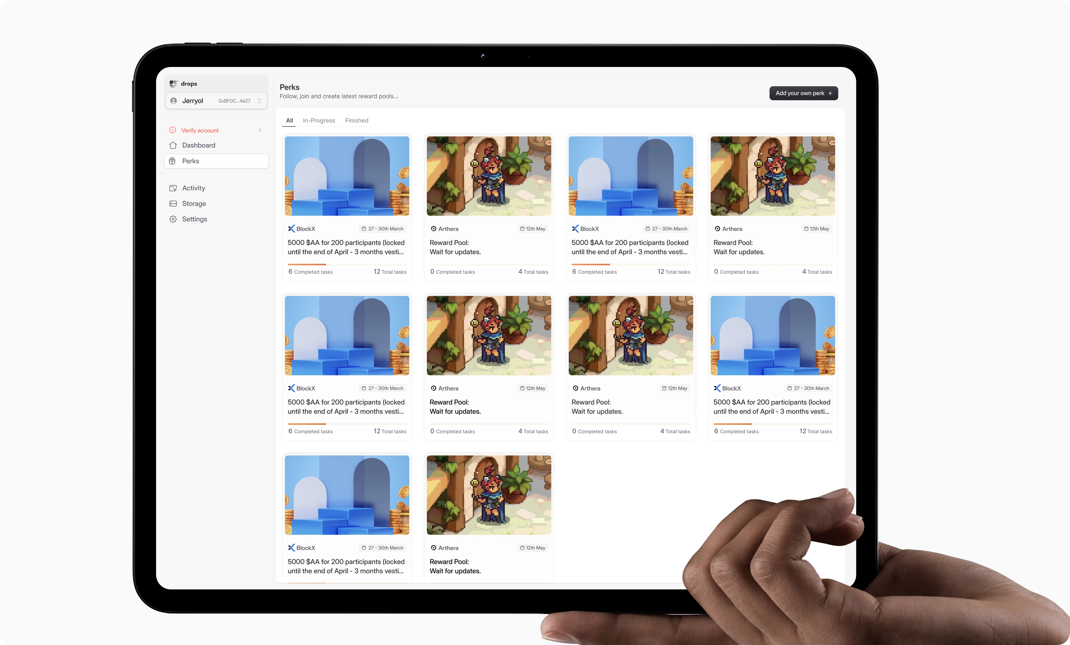
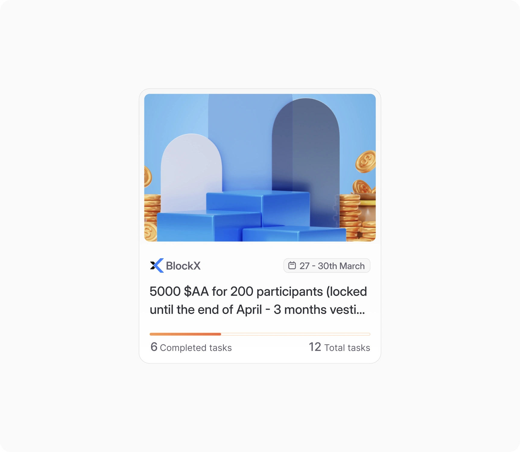
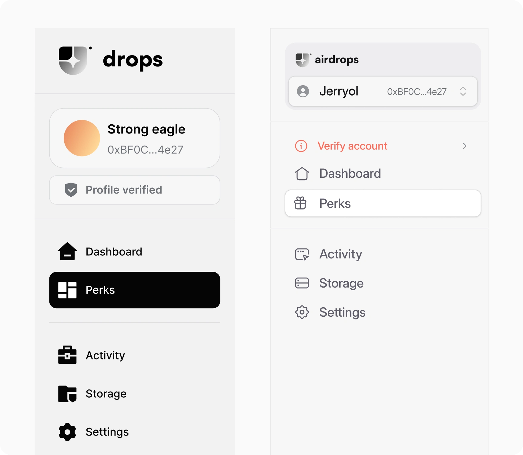
A complete dashboard redesign for an airdrops management platform, with clear layout, harmonised colours, improved text readability, and a revamped information architecture that makes navigating the Perks card effortless.

Why It Mattered
A complete dashboard redesign for a more modern look and improved functionality. Harmonised colours and improved text readability make the experience easier on the eye.
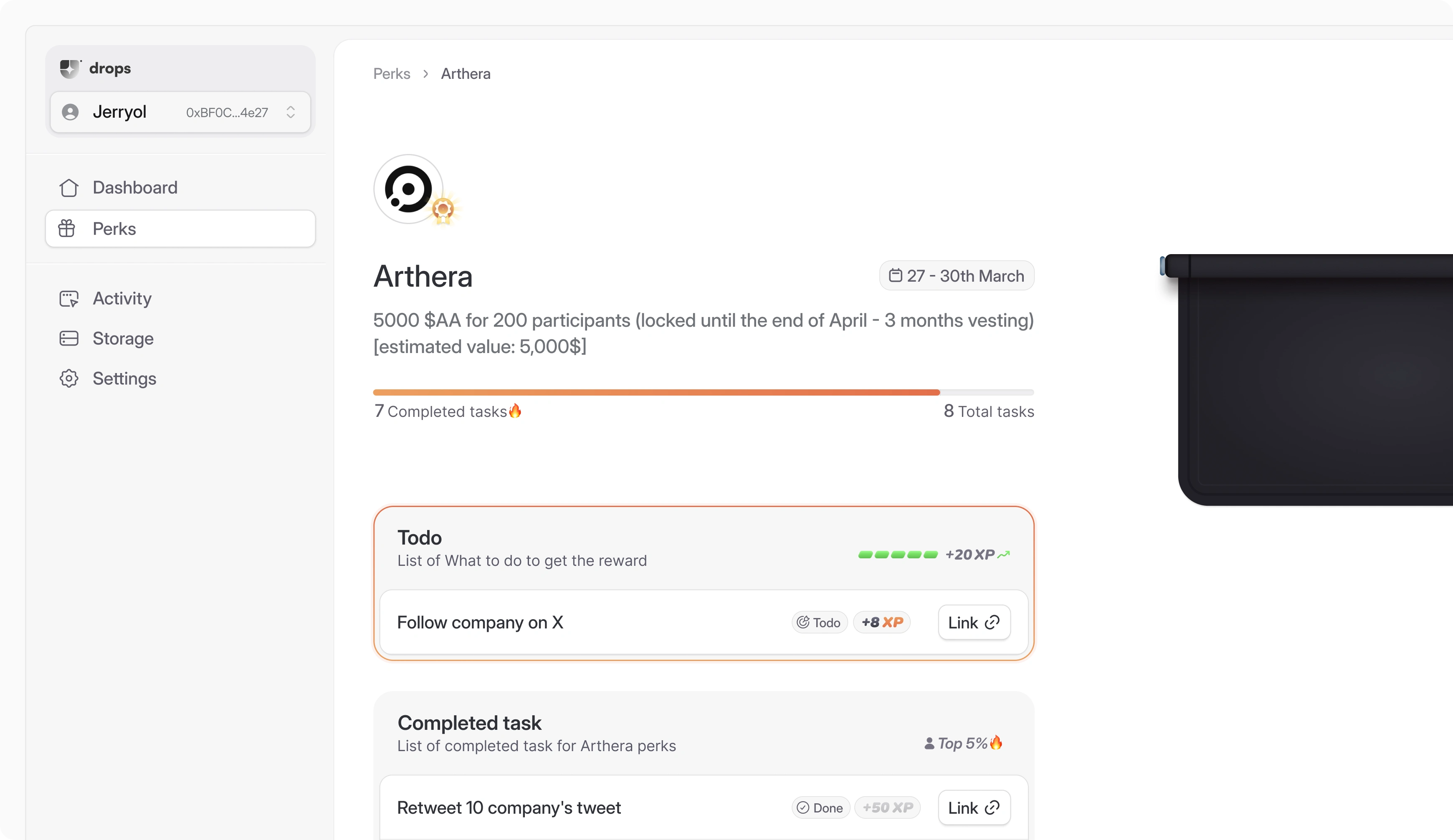
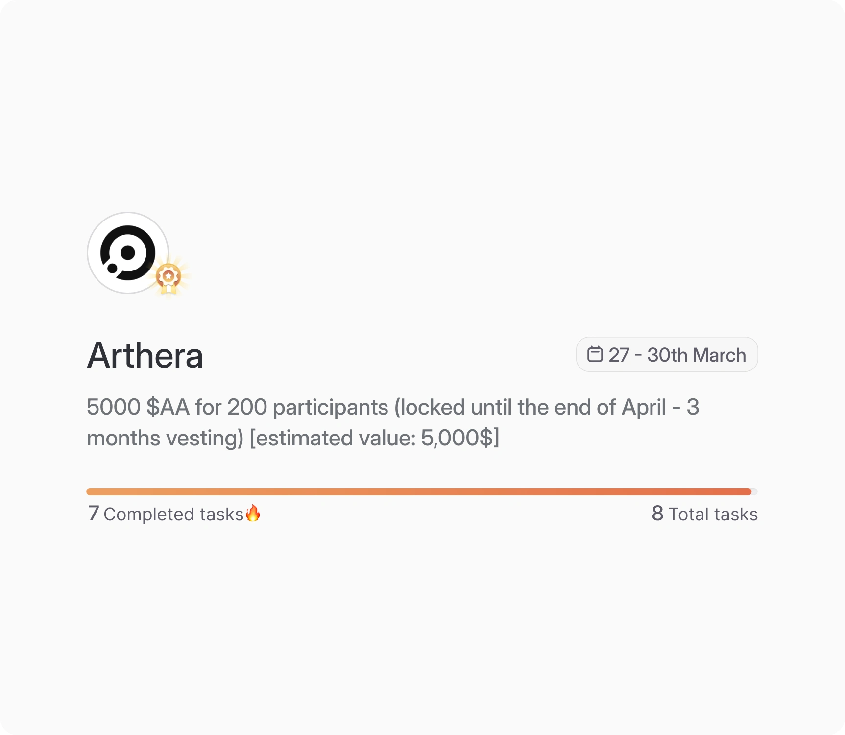
A badge system rewards progress golden for 80% and above, purple for 40–80%, grey for anything below. A fire emoji 🔥 surfaces when a task is almost complete or the user is in the top 10%.
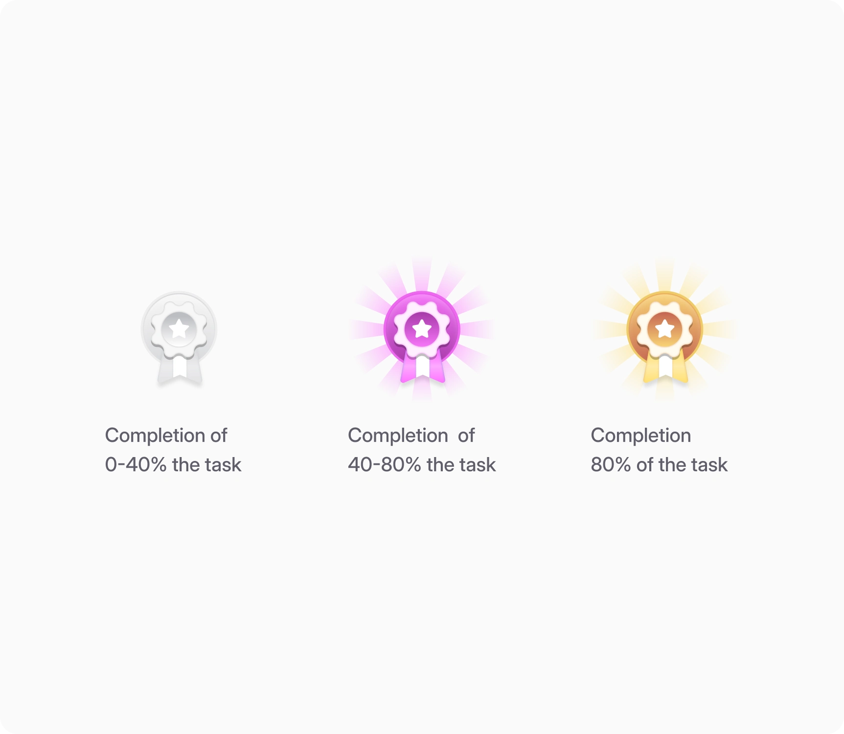
Tasks are measured in XP (gamified), with arrows showing percentage increases or decreases in tasks completed within 24 hours. A revamped information architecture makes navigating the Perks card effortless.

Designs I love.


Reflection
A redesign exploration driven by observation, not user research. The badge and XP systems are directionally strong, but how users respond to gamification in a financial context is untested. That's the question this exploration leaves open.
 LinkedIn Guy