






Singles Event Meetup App
UX Redesign.
This is a focused redesign exploring how a singles event app could better serve users in clearer, faster, and more useful from the moment they open it.

What Changed
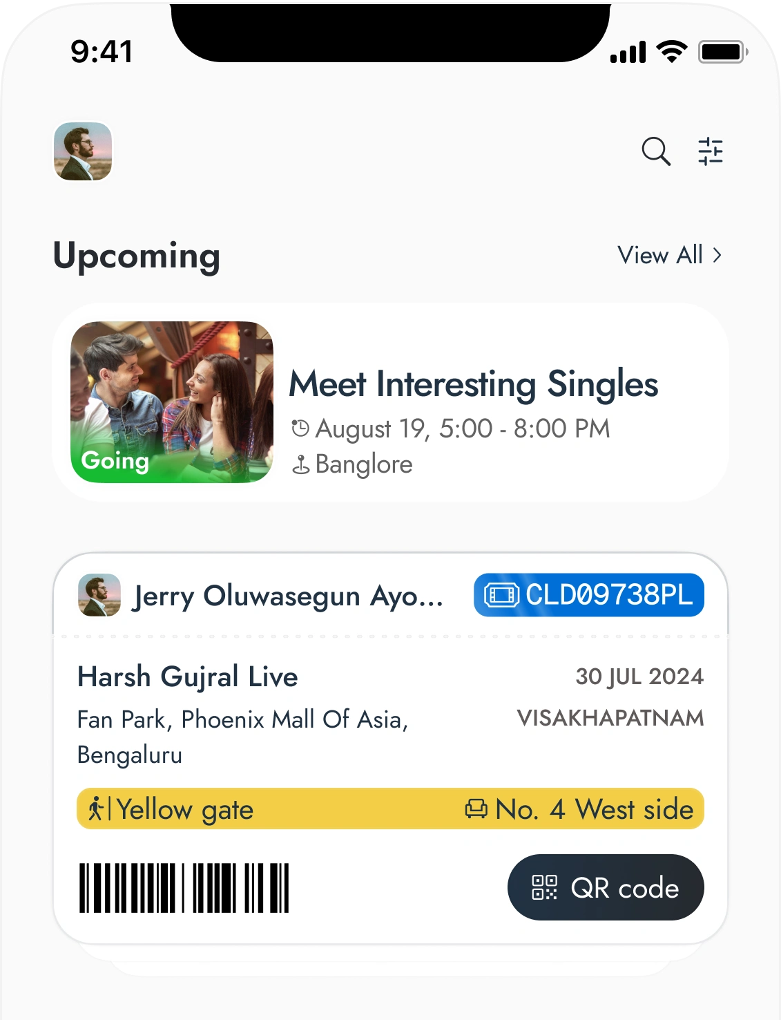
Upcoming events, attendance status, and purchased tickets all visible the moment you open the app. No scrolling, no extra taps.
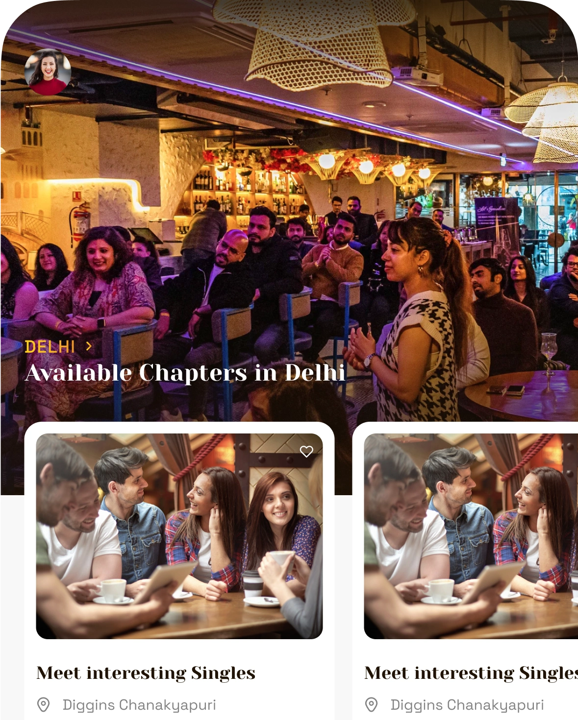
Personalised local recommendations based on interests, with helpful tips and blog summaries before showing events in other cities.
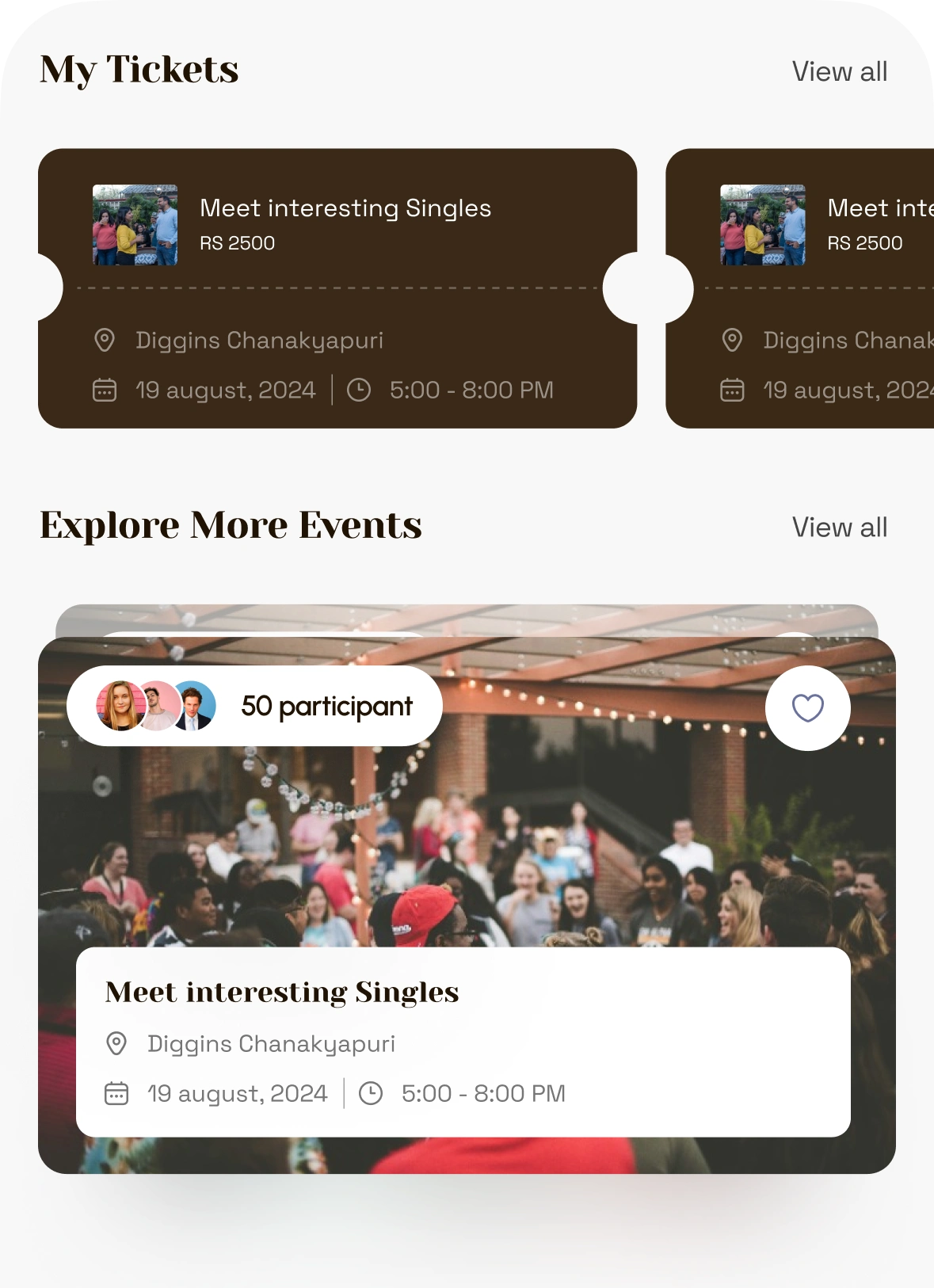
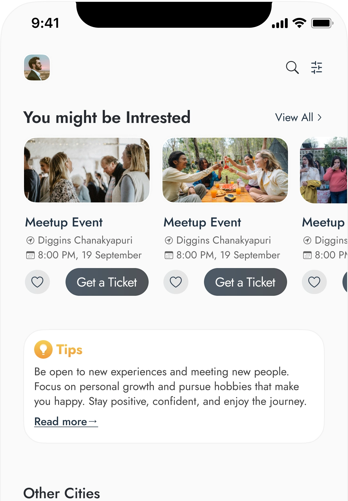
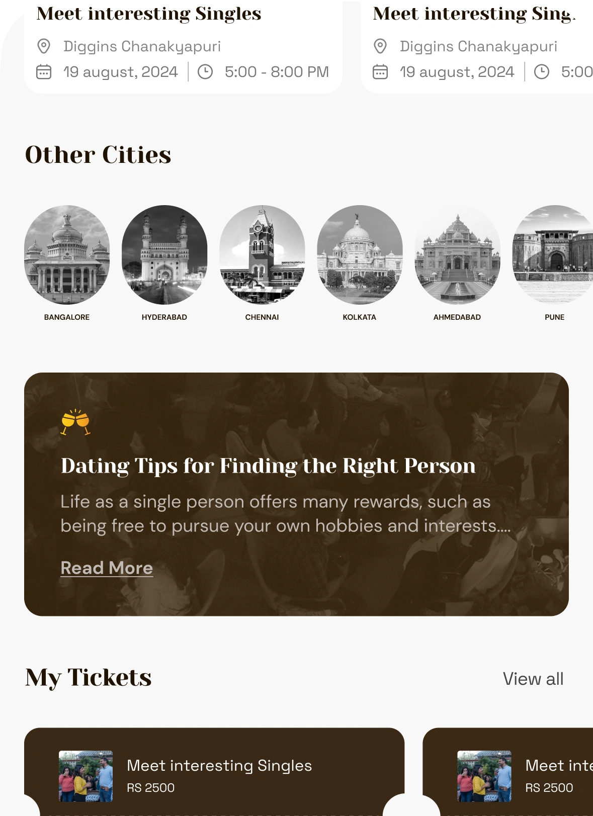
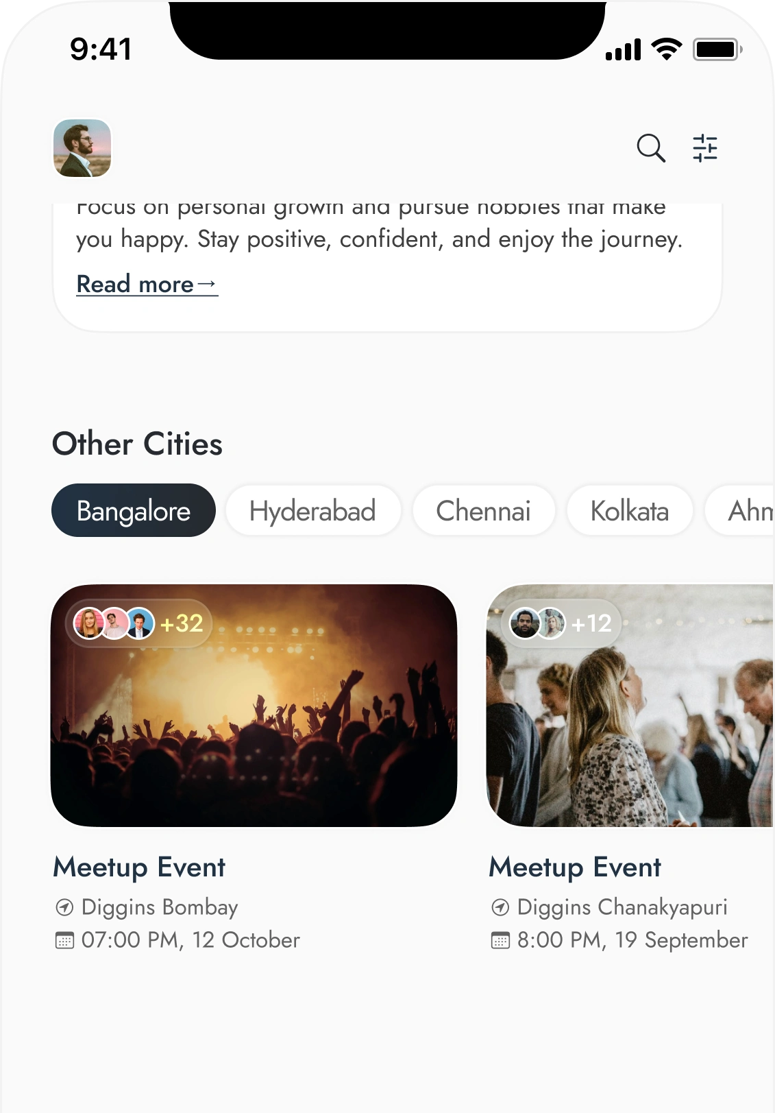
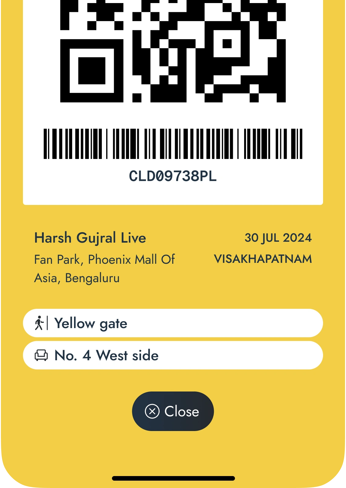
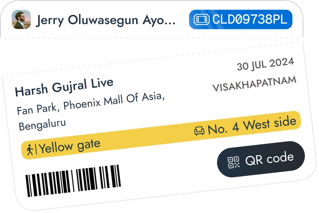
QR code access in one tap, and an information architecture restructured for clarity with room to evolve as the product matures.
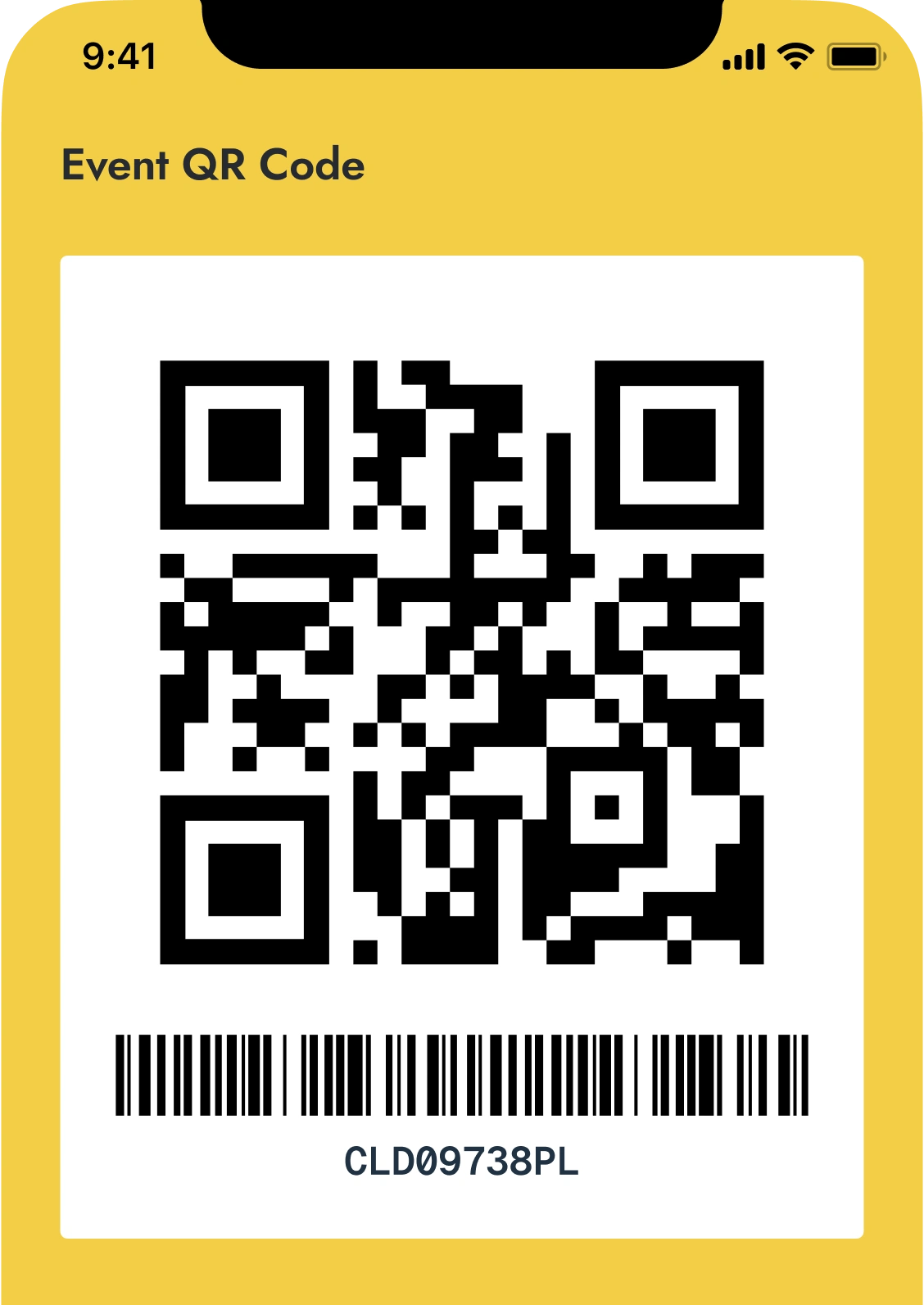

Some designs I love.




Reflection
This is personal exploration driven by intuition, not research. The real test is whether the architecture holds as the app grows, and whether the decisions actually actually serve how singles event attendees think and make decisions is untested.
 Work
Work